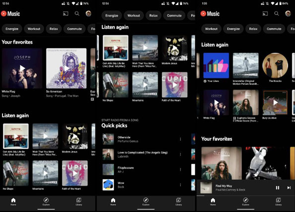
To keep up with its competitors in offering an interactive and engaging UI, YouTube Music has revamped its interface. It has recently redesigned the Listen Again section. The updated version is now available for the Android and iOS versions of YouTube Music. Normally, as per a user’s history, YouTube Music recommended them the tracks that may want to listen to again.

As 9to5google reported that the new design is in the form of cards the songs, artists, and album suggestions appear on the top of the YouTube Music homepage. YouTube has been playing around with the design for a few months now. Back in May this year, it introduced a design for the Playlists as well. The new update for the YouTube Music Listen Again section has also been made available to the web version of the app.
The new design displays six artists/songs/albums on the same page. Earlier YouTube Music had the carousel design. That used to house around two artists aligned with each other. If you want to explore more songs that you have listened to in the past by tapping the More button in the Listen Again section. It allows you to check out around 94 songs you enjoyed streaming in the past. It will appear in a 6X2 grid.
Related | YouTube Music app will get a Dynamic queue feature soon
All the recommendations in the Listen Again section depend purely on the music or artist that you frequently listen to on YouTube Music. To see these song suggestions you do not have to like a song or add them to any playlist.
The new design will help the user discover the music of their choice quite easily. Also, on a larger scale, every user on the app will find it easier to revisit the songs without much effort. You can head to the Play Store to App Store depending upon the device that you use.
