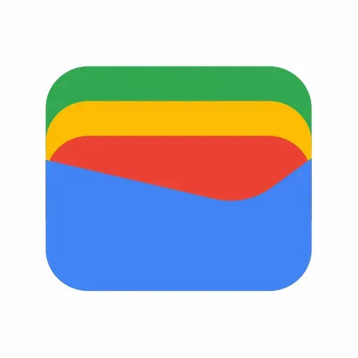
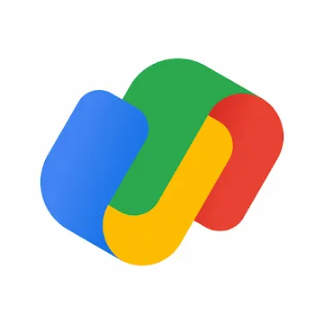
Since the G-Suite to Google Workspace rebranding, the American tech giant has been refreshing its apps and services. The updated icons for almost all these apps and services are great examples of this rapid shift. If you’re a GPay user, you might notice the updated icon of the service. Google claimed the icon represented a physical wallet. But in reality, it looked like something entirely different. And now it seems Google might be working on a new Google Pay icon that looks much like an actual wallet.
![]()
Must See: Google rolls out a critical update to prevent attacks
The updated icon, internally referred to as “Wallet”, is a stack of Google‘s four colours. The colours give the icon its iconic wallet like appearance. The new icon is fitting to the nature of the service as a payment app. Also, it seems a better choice than the icon that is already in use.
Google’s new Google Pay icon
As for now, there are two distinct versions of Google Pay. While users from the US, India, and Singapore enjoy the GPay app with peer-to-peer payment support with other benefits, the rest of the world is stuck with the NFC payments only version of GPay. The old version is still using the Google-branded logo.
Google is trying to make the service a connective tissue for payments across the globe, and its efforts seem to be working in its largest market, India. The new icon will add more meaning to the app. However, we don’t have a clue as to whether Google will implement the same.
Also Read: How to mirror Facetime Video calls on TV using Chromecast
We also wonder whether Google implements this new icon in a new app rather than the existing one. After all, we’re talking about a company that ships both Google Drive and Google One. Only time will tell. Do stick with us for more updates on the same.


