Since the launch of Android 12L last year, Google is optimizing every Android application for the tablet platform. Android has been successful in the smartphone world, but when it comes to the tablet industry, the UI has failed to impress people. So, Google came up with the Android 12L, an Android OS designed for tablets. The UI has changed for the large screens and now uses the space more efficiently.

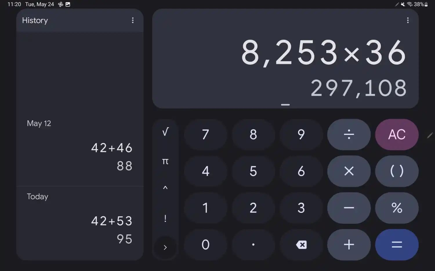
After changing the UI for Android, Google has now shifted the focus to Google apps. Recently, Google changed the Lens app, and now it is the Google Calculator. Like most of the other Google apps, the Google calculator was also not optimized enough to use the large tablet screens in landscape mode. But, now it is changed, the new Google Calculator uses the entire tablet screen to make the app more suited for tablets in landscape mode.
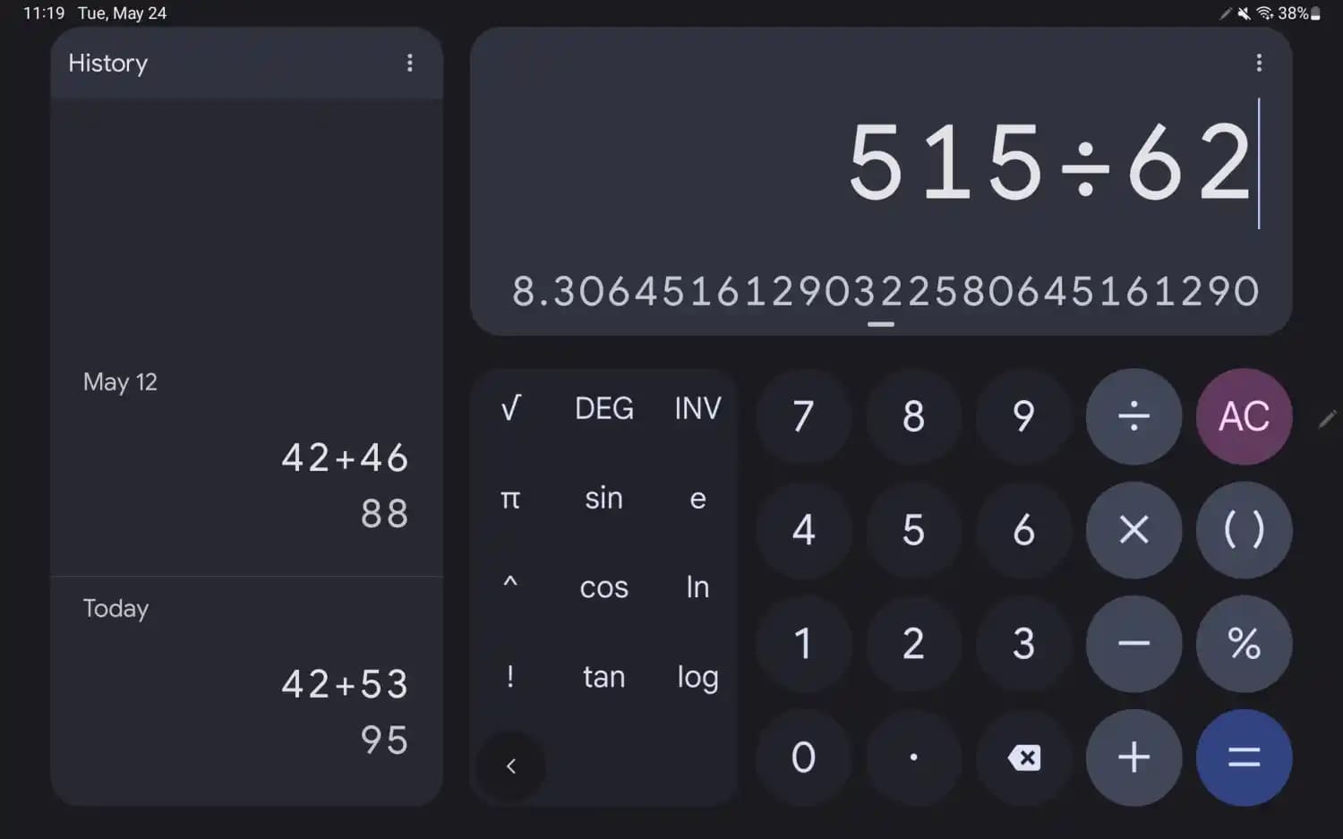
The change in the UI came with the new Google Calculator 8.2. The new UI brings two columns, one for the regular calculator, and the other displays the history. This might be useful for users who do their entire math on the Google calculator as the previous calculation is on the screen while performing another. Previously, users have to pull down the screen to see the previous calculations.

Google has also increased the size of the calculation area to use the screen space available. Also, the extra function which used to take up the space on the screen can be hidden when the user doesn’t need them. Hiding the extra function changes the shape of the buttons on the calculator from circle to pill. This changed interface is available in the landscape mode, you can still use the old interface by using the calculator in portrait mode.
Also Read: Google Voice now lets you set custom rules for incoming calls
The new Google Calculator 8.2 is rolled out via Google Play Store and is only available to a few. It will be available to all Android tablet users via Google Play Store, while the smartphone UI will still remain the same as the previous version.
