This year marks the 20th anniversary of Google News and Google is celebrating by redesigning the Google News platform for desktops. Google News is available on most modern-day platforms like Android, iOS, and desktops. While the Android and iOS version of the application looks modern and updated. The desktop version carried a very old design for so long. Now, Google has changed the desktop version of the service and it looks more modern and organized.

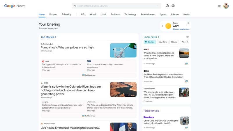
Google changed the old boring look of the Google News platform to something similar to what we have seen on smartphones. The new design approach resembles the Android and iOS design of Google News, however, it is not completely the same. To start with, the Google News logo is at the top left corner and the search bar next to it. Now, the navigation bar is also changed as it is available at the top under the search bar. Previously, it was placed on the left hand side of the screen.

Related | How To Use the Google Chrome Web Feed
The navigation bar at the top starts with the Home tab and followed by For you, Following, and the News Showcase tabs. On the left partition of the new navigation bar, tabs for world news, locals news, business and science is available along with some other tabs. The news page starts with a Your Briefing header which provides date, day and wheather. After the header, the Top stories section is present on the screen and the local news and picks for you section is right next to it.
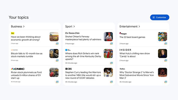
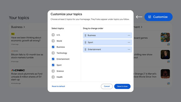
Your stories section is the next section available on the page. Which is now customizable as you can customize the cards in the section. Below this, you will find the For you, Sources, and the Fact check section. The new fact check section provides the informations regarding the claims and rsearch on facts.

Th new Google News is out now and you can try it by going to the Google News page and clicking on the Try it option available on the top of screen. It will take you to the new redesigned Google News page. You can try this new Google News from today.
