Google introduced its new design language, the Material You with the launch of Android 12 last year. The new design language gave a more flat and materialistic look to the apps and the overall Android UI along with the pre-installed Google apps. Material You has been a great success on the Android platform and now, Google is implementing the same on other platforms.
![]()
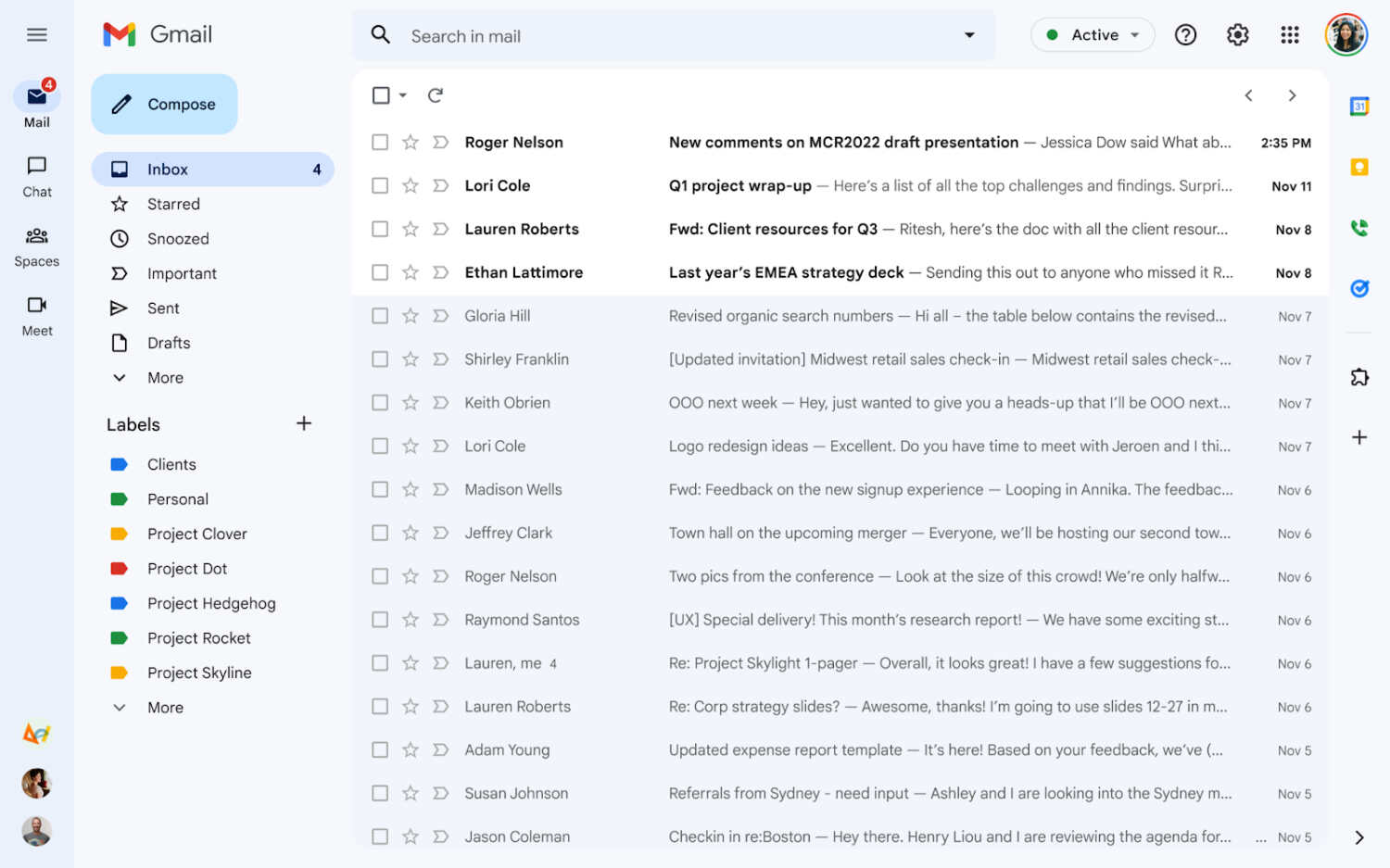
Google applied the Material You design to all the Google apps on Android and now other platforms will receive it starting with Gmail. Gmail received a design overall at the start of this year, which was not appreciated by everyone because of the overall integration issue. Now, Google has provided a solution for that along with the Material You design. There is a new feature called Gmail only which will remove the Meet and Chat from the Gmail. So, users can see only the emails on the screen, however, users can switch it back whenever they want.
 Image credit: 9to5google
The new Gmail with Material You is available for some users now but soon will be available to all. Google has changed the background from white to a shade of blue which can be seen on the entire page. The read mails are light blue in color and the unread ones will remain white. The compose button has also changed to a rectangle with rounded corners just like the one on the Android platform. On the left side of the screen, users can find all the folders, and on the right side is the panel for Calendar, Keep, Voice, and Tasks. Which can be removed by switching to Gmail only.
Also Read | How to Strikethrough in Gmail
The old classic Gmail will still be available to users if they want to switch to it. However, the new Material You design will be the default one. Google has still not updated the Google apps on iOS to the latest Material You theme, but that might change soon. The new Material You Gmail for the web is rolled out starting today to all the Gmail users.
