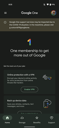
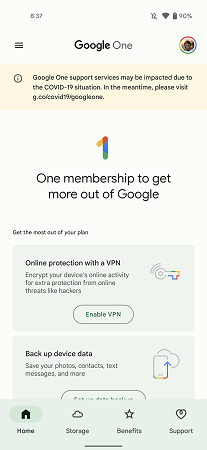
Google One is the brand’s subscription-based cloud storage service. It came in as the replacement for the paid services of Google Drive. Even though the service came in 2018, it received very minimal UI tweaks to keep things consistent. It also meant the users had to stick to its brighter look. Not a great thing if they spend too much time in the app. Google had announced their new Material You UI design in I/O 2021. After months of waiting, Google One is getting the Material You facelift. The fun doesn’t stop there, as the app will be getting a dark theme as a bonus with the Material You facelift.
Must See: YouTube Music comes to Wear OS 2
According to Google, Material You will be the next main thing for upcoming Android devices. Material You was also one of the few features Google spent some more minutes detailing in I/O 2021. With this new redesign, Google One will be able to better leverage the new Dynamic Color. Also, we believe the newly added dark mode will be the deciding factor for many to update to the latest version.
The new Google One Material You facelift
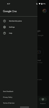
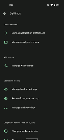
Changes to the UI are noticeable right from the start. A new navigation bar at the bottom replaces the old one at the top. The order of icons in the navigation bar remains the same as it was in the previous version. However, the Setting icon has been moved from the navigation bar to the new navigation drawer up top. The drawer also provides access to the Membership plans pricing list.
You can spot the new Dynamic Color throughout the app, including the app icon. Still, Google has left certain UI elements to follow a minimal black or white colour, including the Google One title in the app bar. The dark mode is also very well implemented with the new update.
Also Read: Google hardware event on October 5th, 2021?
Aside from these UI uplifts, the app is still the same from a functionality perspective. Still, we highly recommend that you try it out. You can update Google One on your Android device from Google Play Store.

