Google has been quiet for quite a while with the design of Google Podcast. And earlier this month, we saw that silence break. Google silently revamped the UI of the app for Android earlier this month. Well, guess what. Google Podcasts gets redesigned Now Playing UI for iOS as well. Here is everything you need to know about the update.

Related: Google to seize Google Play Movies & TV app service on Roku and LG, Samsung, Vizio TVs in June
While the update won’t bring anything game-changing in the front end, it certainly brings some needy features under the hood. The user can not only add favourites, but they could also block any irrelevant recommendations.
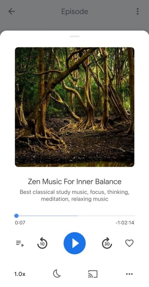
The New Google Podcasts Now Playing UI
As said earlier, the UI seems to be an exact copy of the one we saw on Android (did they actually made them using Flutter?). As seen in the Android variant, the Playback speed, Sleep timer, Cast, and the menu button are flush at the bottom and doesn’t seem to be going anywhere. The menu button (or, more professionally, the overflow button) is for accessing additional features like Recommendations, Share and Mark as played.

The playback sections seem to have a much familiar design. A queue button, followed by the playback buttons including Play/Pause, forward and backwards seek buttons. It is then followed by a favourite button (heart). Users can also make use of the timeline scrubber under the episode/show name. As always, the UI looks more modern and clean. Apple users can update the app manually if they haven’t yet received the update.

More Personalized Feed
No one needs to teach Google about personalizing content for each user. And they’ve taken it a step further with the blocking contents a user doesn’t want to show on their feed. This can be done by click on the menu button at the bottom-left corner of the app. They have the option to either show fewer recommendations or block similar ones.
The user could also visit the Google My Activity page to view the history of the Podcasts customizations they’ve made. This allows them to customize the Explore tab, which was not possible previously.
Also Read: Google I/O Developer Conference 2021 will commence from May 18
We hope the privacy and security updates that come with iOS 14.5 won’t be an issue for this one. Apart from that, we believe Google’s decision is a step up in personalized contents. And do keep in touch for future updates and news on Android and iOS.
