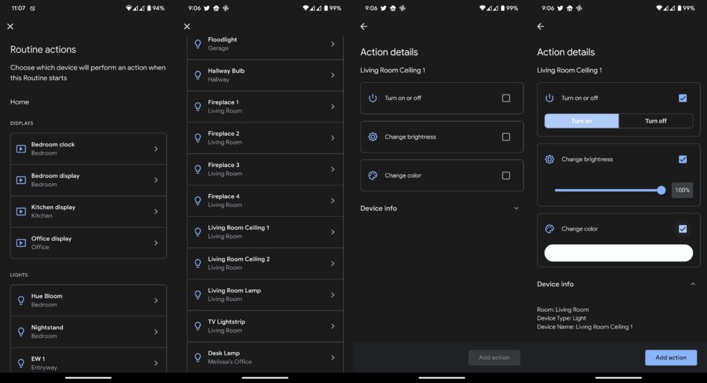
Google has been revamping its UI for quite a long time now. The UI redesigning has reached the Google Home app now. Google previews the UI changes by rolling out its new interface to a few users. It is live for Google Home Public Preview redesign and standard Home app design. The new interface has broken the Assistant routine for some users. The app had rolled out a new interface for adding smart home devices to routines.

Earlier, the Google Home app allowed users to adjust the on or off settings through a drop-down setting on a single page. It didn’t allow users to change settings other than switching on or off. The new page will allow routines to manage various features of each device on a single page. It will allow you to change color, brightness, and more depending on the device, you want to control. The new change is one step ahead of Google’s achievement towards powerful automation.
However, the app now takes more time to add smart home devices to the routine. The users should add an individual step in the routine for every device for turn-off functions. That is, one needs to add every device for the Assistant to turn off all your lights. Another way is to add a custom Assistant command saying turn off all the lights.
Related | How to Fix Could Not Communicate with your Google Home Mini
The update also breaks personal routines for some users. Some also complain that the routine editor isn’t working properly now. A few months back, Google was rolling out a new update for Home that would let users view their Nest camera and doorbell feeds on the web. The feature will allow users to easily check in on live views in full screen, zoom in to see more details, view camera status, and more.

